Labacha - Shopify Theme Documentation
  • Introduction
  • Changelog
  • Full Theme Features in Labacha
  • Installation
    • Install Theme
  • BASIC CONFIGURATION
    • Customer Registration
    • Shipping Rates
    • Navigation
    • Sticky Toolbar Mobile
    • Online Store 2.0
      • Color Gradient
      • Dynamic Source
  • Theme Settings
    • Multiple Layouts
    • Typography
    • General
      • Container Width
      • Favicon
      • Wishlist
      • Terms and conditions
      • Swatch
      • Hot stock function
      • Add To Cart Action
      • Lazyload image
      • Slider Dots
      • Slider Arrows
      • Pagination
      • Trust Image
      • Button Style
      • Social Share
    • Product Card
      • Set up for Product Card
      • Product badges
      • Product Swatch
      • Product Action
      • Product Review
      • Product Quick Shop
    • Theme Language
      • How to set up a different language?
      • How to set up Multiple Languages?
    • Multiple Currencies
    • Multi-Level Categories
    • Quick Search
    • Quick Cart/ Quick Edit Cart
    • Quick View
    • Countdown
    • Calculator Free Shipping Message
    • Someone Purchase
    • GDPR Popup
    • Newsletter Popup
    • Recently Viewed
    • Notify Me: Out Of Stock
    • Ask An Expert
    • Social Media
    • Color (Products)
    • Colors (General)
    • Typography (Products)
    • Adding custom CSS to your theme
  • Header
    • Header
    • Search
    • Megamenu/Drop Down Menu
      • Label For Menu
  • Footer
  • SECTIONS
    • Section On Every Page
    • All Sections in Theme
      • Slideshow
      • Slideshow Grid
      • Slideshow Category
      • Collection List Packery
      • Collection List Packery 2
      • Modern Page Banner
      • Modern Banner
      • Modern Grid
      • Modern Image With Content
      • Gallery Section
      • Image Banner
      • Image Banner 2
      • Product Block
      • Product Block 2
      • Product Block 3
      • Product Block 4
      • Product Tab
      • Collection Grid
      • Collection Grid 2
      • Collection Grid Slider
      • Brand Slider
      • Category Slider
      • Featured Blog
      • Newsletter
      • Newsletter 2
      • Newsletter 3
      • Newsletter 4
      • Custom Liquid
      • Rich Text
      • Google Map
      • Page Banner
      • Image With Content
      • Image With Content 2
      • Image With Content 3
      • Video Popup Banner
      • Custom Service Block
      • FAQs Section
      • Latest Blog
      • Customer Review
      • Recently Viewed Products
      • Instagram
      • Offer Gird
      • Breadcrumb
      • Page
      • Marquee
  • Collection & Product
    • Collection
      • Demo & Settings Data
      • Sidebar
      • Category
      • Filter
    • Sub Collection
    • Collections List Section
    • Product Page
      • Demo & Settings Data
      • Product Media
      • Product Tab
      • Product Variant
      • Size Chart
      • Short Description
      • Checkout Button
      • Compare Color
      • Sticky Add To Cart
      • Infomation
      • Sold In Last
      • Hot Stock Function
      • Countdown
      • Customers Viewing Function
      • Trust Image
      • Custom Information
      • Product Review
      • Product Description Tab
      • List Tags
      • Variant Image Grouped
    • Product Recommendations
    • Recently Viewed Products
    • Product Combo
  • Other
    • How To Create A Page?
    • Find A Store/ Store Locator Page
    • Wishlist Page
    • About us
    • Contact Us
      • Layout 01
      • Layout 02
    • 404 error
    • Blog
    • Cart Page
    • Search Page
    • Checkout
  • Browsers Compatibility
  • Official Support
  • Copyright
Powered by GitBook
On this page
  1. Theme Settings
  2. General

Slider Dots

PreviousLazyload imageNextSlider Arrows
  1. From your Shopify admin, go to Online Store -> Themes.

  2. Find the theme that you want to edit, and then click Customize.

  3. Click Theme settings -> General -> Slider dots.

1. Dots style

Setting
Description

Style

Select the style of slider pagination dots. Style 1: Dots will simply styled with its background, border and hover state color. Style 2: Dots group will also have a background layer.
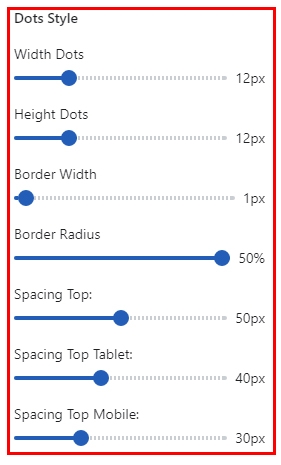
Width

Determines the width of the slider navigation dots.

Height

Determines the height of the slider navigation dots.

Border Width

Determines the Border width of the slider navigation dots.

Border Radius

Determines the Border Radius of the slider navigation dots.